Got ideas or a problem you need help solving? We’ve got the skills. Let’s team up.
Got ideas or a problem you need help solving? We’ve got the skills. Let’s team up.
2024
We use our creative skills to build really cool things for the greater good of the planet.
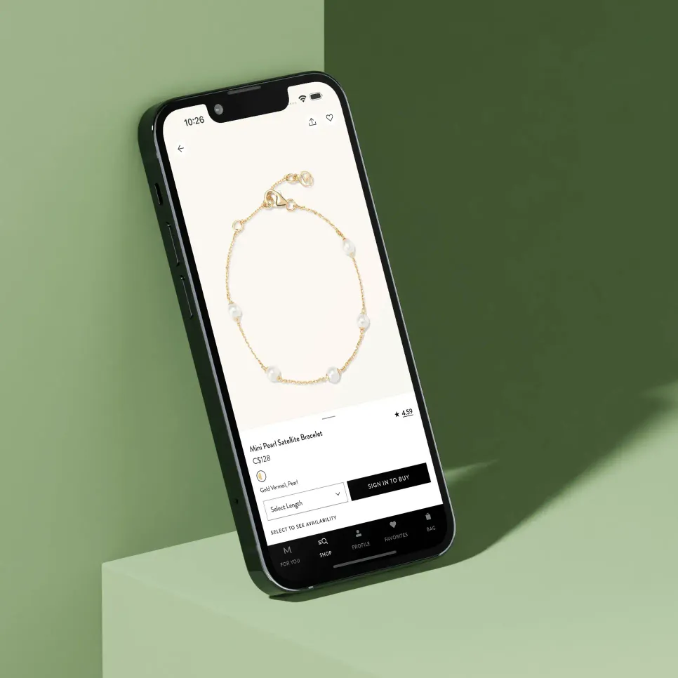
If you’re familiar with mobile development, you know that everything that’s easy to do on web, is just a little bit harder with React Native. Our goal was to create a intuitive, luxury experience that prioritized discovery and personalization.
We took every opportunity to not say no to features that were deemed essential, no matter the complexity. to that end, we built as close to custom as we could to ensure a unique experience.
Keeping the user in mind, we were sure to be clever about when we fetched data and how often. To keep consistency throughout, we used React Query to fetch and store data that we could use to reduce fetching. For example, there’s no value to fetch data everytime the product category page is visited, so we fetch once on initial load, and never again.
Having requests to a server kept to a minimum, we not only reduce load times and provide a snappy experience, but we also save some energy.

We made sure that all images used in the app were served in modern formats, including native HEIC images for iOS. To achieve optimal performance, we optimized and embedded images in the app, or delivered them via an efficient image service. This approach allowed us to balance beauty and performance, resulting in an aesthetically pleasing and seamless user experience.
Creating tests can give a false sense of security as they cant catch every test case. To help us debug and catch issues early, we used Zod to help us type everything. We could easily understand what data was missing, and how to fix it before we sent the app into the world. As well, we used libraries that helped us type our GraphQL calls and fragments.
One of the best ways to ensure consistent styling and maximum efficiency is by using a design system. For Mejuri’s React Native app, we leveraged Tailwind CSS classes in both our Figma and code. By incorporating a common design language, we were able to simplify the styling process and focus on deeper logic to help the app move quickly.

Digital sustainability and stunning design are not mutually exclusive, as proven by our work on Mejuri’s React Native app. While building an app with React Native is still relatively new territory, we trusted our skills and expertise to create an incredibly successful product.
Overall, the app stands out as one of our proudest projects, a testament to the power of sustainable digital products that prioritize both performance and design.
(02)
Got ideas or a problem you need help solving? We’ve got the skills. Let’s team up.